MTA Capital Plan Dashboard

At the MTA, I contribute to tools that make capital planning data accessible to the public. The Capital Plan Dashboard is an interactive web application enabling transit riders, planners, and government stakeholders to explore the MTA's capital investment portfolio — the largest capital program in the agency's history.
The dashboard surfaces data from the New York Open Data Portal, visualizing project funding, geographic distribution, and execution timelines across all MTA divisions: NYC Transit, Long Island Rail Road, Metro-North Railroad, Bridges & Tunnels, and MTA Police. A core feature is the ACEP (Annual Capital Expenditure Plan) integration, which provides a granular view of how capital dollars are being spent against planned allocations at the program and project level.
On the technical side, the application is built with Next.js and TypeScript, using Mantine as the component library and OpenLayers for interactive mapping with live ArcGIS layer integration. Budget charts are rendered via Plotly.js and Recharts, while Arquero handles in-browser tabular data processing for fast filtering and aggregation without a backend query. State is managed with Jotai, and the site is deployed on Netlify.
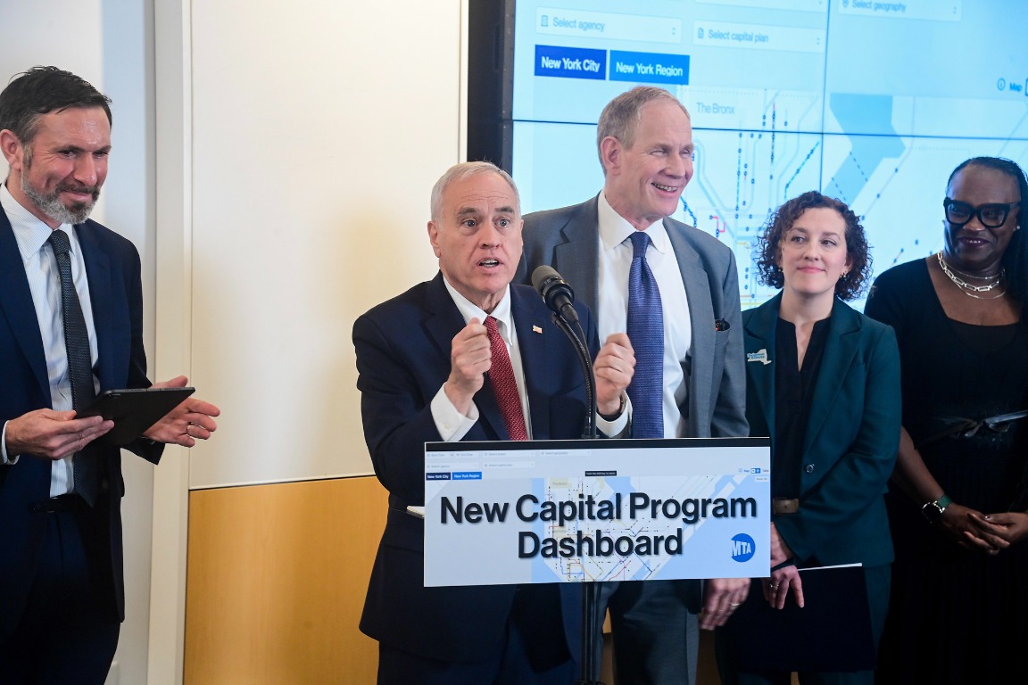
The dashboard launched to the public and was featured at a press conference alongside MTA leadership, making it one of the most visible deliverables our team has shipped.
The dashboard is publicly available at capitaldashboard.mta.info.